Version 0.2.0 Update
Version 0.2.0 is out! We spent the last 2 months adding a variety of features to Mad Mark (actual name TBD) and improving the artwork. Things mostly went well, but there were a few frustrations and things to learn from.
In this post, I'll talk about what we did and why, what went well, what didn't go well, and what we plan to do next.
To a user, the changes we made don’t seem too dramatic. The game largely feels the same as version 0.1.0, because there isn’t anything to do yet. You can rip your bike across the test map, doing donuts in the sand and blasting other bikers you come across...but that’s it. And that isn’t new. Anyone following the game (I think that’s probably no one right now why am I writing this aah) might think we did nothing. But that’s not the case. We made lots of progress behind the scenes that will enable us to bring the game to life over the coming months.
So...what did we do?
The main goal of this iteration (which I will now call V2) was to make the existing experience look more polished. Yes, the game is in its infancy, and I will explain later why we wanted to do this.
Our art style evolved (we never really decided on a style to begin with), and now has outlines on important things like players and enemies. We zoomed out the view and slowed things down so it wasn’t so blurry. We settled on a resolution of 480x270, which called for smaller sprites. For example, the player’s bike used to be 33 pixels long, now it is 19 (the odd numbers are used to give an exact center pixel so the bike rotates symmetrically).

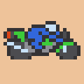
Old bike (red) and new bike (green)
We put effort into the roughest looking parts of the game, particularly the HUD. We used to just draw your health, shields, weapon heat, and ammo in random spots on the screen. It was information you needed to know but it didn’t look good. We decided to double down on our theme and fit the whole HUD into some gauge clusters like you might see on a real motorcycle. They’re far from perfect, but it makes the whole thing feel much more like a game.

The new HUD fits everything you need to know on the gauges at the bottom.
We also added an item system, which wound up being quite complicated. We wanted the player to have options for building their bike in different ways, so we came up with a few components that you can equip: an engine, a battery, a shield, two weapons, and 3 modifications that will do anything from damaging everything around you when your shield pops to helping you find more loot on the ground. We took a lot of inspiration from FTL: Faster than Light for our item and inventory system. We only have one of each item type at the moment, but now that the system is in place, we can add more easily.
Building your bike wouldn’t be interesting at all without trade-offs between the different items. If you could equip any engine at any time, then you would always pick the best engine and there would be no thinking involved. No fun. So we decided to use a power mechanic (also inspired by FTL) for your bike. Every component (with the exception of modifications) uses a certain amount of power. You only have a limited supply of power provided by your battery. Better items use more power. So if you equip a really powerful weapon, you may have to settle for a lousy engine and vice versa. You can use more power than you have, but your components will underperform significantly (inspired by the weight mechanic in Dark Souls). Unlike FTL, you don’t allocate your power between your different equipped items, as this would be impractical. If an item is equipped, it draws its full required power at all times.
What went well
At the start of V2, we spent a few hours determining what we needed to work on. We wanted to prioritize making a polished, vertical slice of gameplay before creating lots of content. We wanted lots of the “juice” that makes a game pop, like crisp camera movement and nice explosions. I’m not convinced we’re anywhere near done with those things but it looks nicer than it did. We saved content for later, such as making more weapon types, enemy types, bosses, environments, quests, etc.
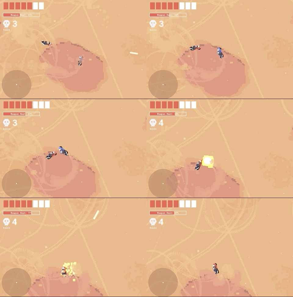
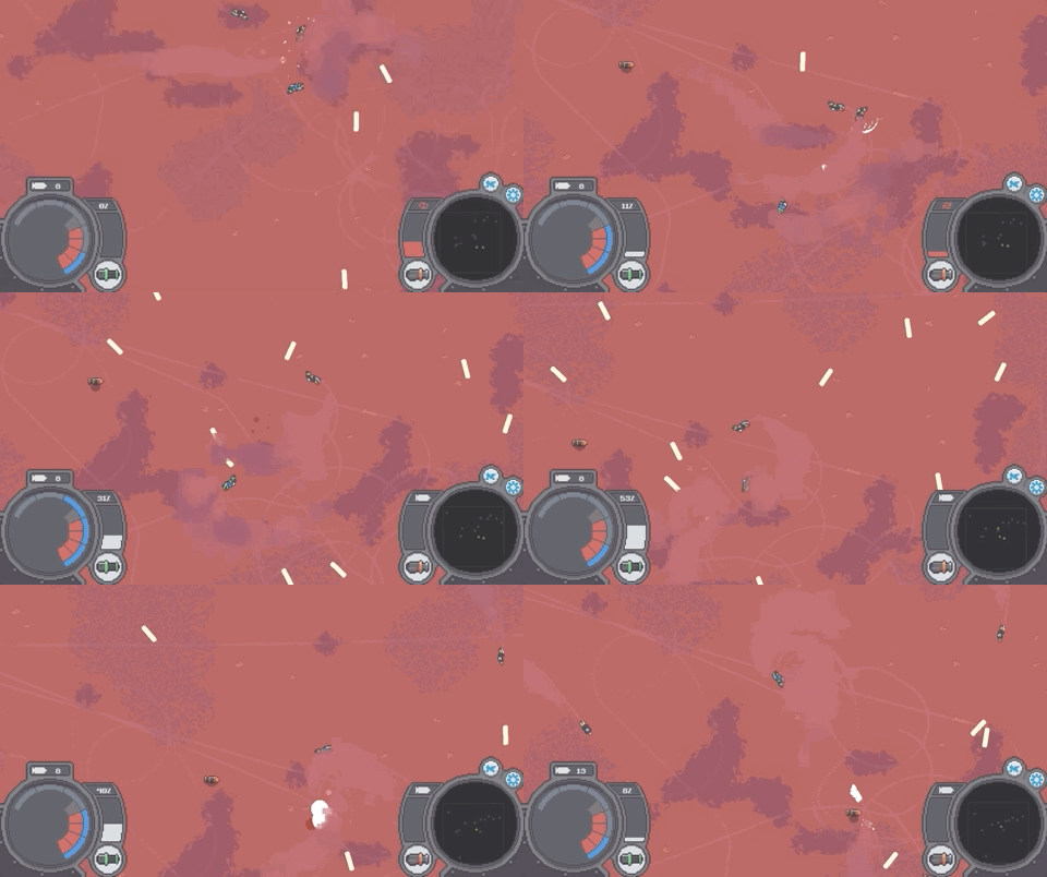
New HUD, better explosions, bigger view of the action in V2
We also spent a few hours estimating the time it would take to make our vertical slice. Our estimate ended up being reasonably close (as far as estimating software goes). We imagined 422 man hours for V2 and ended up working 309. We were thrilled by this, since it’s not uncommon for something to take 10 times as long as you expect.
We were fortunate to do a good job estimating. The numbers were a little daunting at first (400 hours to add items and some more art?), but it was easier to swallow early on rather than be surprised by it later. The largest part of V2, adding items and an inventory to use them, ended up going well for us. We thought it would take the better part of two months, but Patrick knocked it out in under 2 weeks.
What didn’t go well
Scope creep got us again. It always does. When building a project with hundreds of interconnected parts it is all but impossible to predict everything you need to do ahead of time. Often, you don’t realize your game needs something until you realize that it’s missing. We tried to be strict with extra work we brought in, but inevitably, we discovered more along the way and we did it. This took up perhaps a third of our time for V2.
What makes this the most difficult is that it’s work that needs to be done. But it doesn’t have to be done right now. Did I really need to redraw the player’s bike? Did I have to make 20 variations of pebbles on the ground?
These things feel good to do, but building a game is a bit of a backwards process. You want to get it feeling good quickly so you can make sure the core of your game feels good. For us, this was driving around. Then you want to make your game look really good, so that other people enjoy it. You can get a black square to drive around the screen just like a real bike and it feels boring, but replace that square with a bike that leans and kicks up dust and leaves skidmarks and suddenly you feel like you’re driving around.
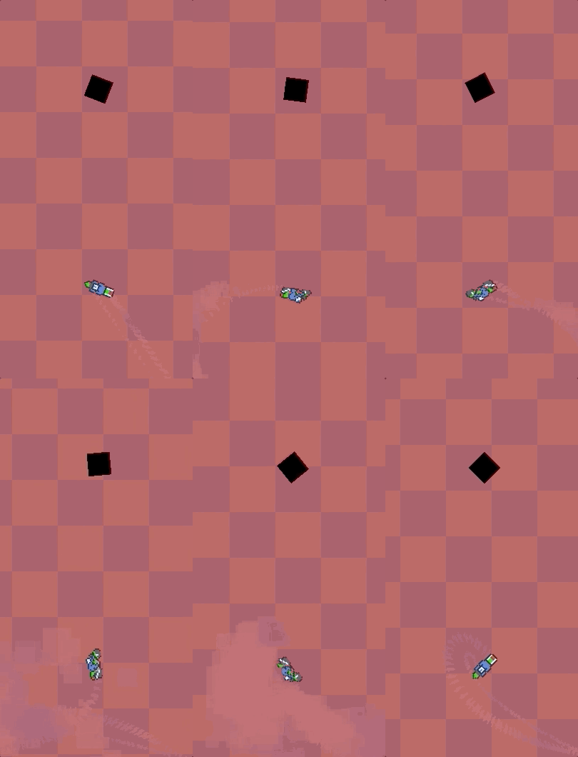
The square and the bike move in the exact same way, but which is more fun to drive?
So why do you want to worry about making your game look good early on? Because you need to start selling it well before it is done. I don’t mean literally selling it, I mean getting people interested who may want it when it is complete. It feels wrong to be polishing your game when most of it doesn’t even exist yet, or to be “wasting” your time making nice screenshots. You would rather be, you know, working on the game. But if you bury your head in your work and don’t let anyone know about your game, or give them a reason to care about it, then nobody will. And what fun is making a game that nobody plays?
We are definitely guilty of this. Sharing our game is not our best skill. We always feel that it isn’t good enough yet. We’re embarrassed by what we have and always want to add one more thing before we show it off. Getting myself to take a break from working on the game and write this article was a struggle.
One more challenge we faced was environment art. At this stage, I was doing most of the art while Patrick was programming, and I think I found my kryptonite. I can draw a nice bike. Effects like shields and fire and explosions are fine too. But nature I really struggle with. Especially rocks. I hate rocks now. I spent two weeks drawing rocks and still couldn’t get them to look right. I finally had to move on and plan to come back for them later. As a result, the game world is just an empty expanse of sand at the moment.

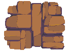
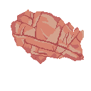
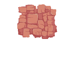
Me learning to draw rocks. I hate rocks.
What’s next?
Following this will be the aptly named version 0.3.0 (or V3). We talked a bit about this version, and decided we wanted to focus on adding some content, particularly items and enemies. We feel that coming up with a strategic build for your bike is part of the core gameplay, and it isn’t possible without any tools to build with or enemies to design it for.
Our personal lives went through a turn this very morning, as the contract project Patrick was working on two days a week to pay his bills became suddenly cancelled. We will decide how much time we have to dedicate to this game now that savings are slowly bleeding out. The worst case, cancelling the project entirely, has always been a looming threat. While we hate to do it, we’ve done it before. It’s just a fact of life for Indie developers. We’ll keep all our fans (probably our Moms and a few friends) updated no matter what happens.
Thanks for reading!
Get Scoot Or Die
Scoot Or Die
Motorcycles with guns in the desert! A mini open-world rogue like
| Status | Prototype |
| Author | PerchDrunkThugz |
| Genre | Adventure, Survival |
| Tags | Driving, Open World, Pixel Art, Roguelike, Tactical |
More posts
- Programmatic Tiling in World GenerationNov 20, 2019
Leave a comment
Log in with itch.io to leave a comment.